Temporary Museum Amsterdam
Concept, curation and design of side program Amsterdam Art Fair, 2006, 2007, 2008, 2009
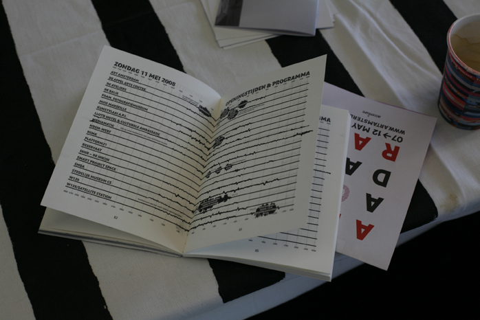
The Temporary Museum Amsterdam was the parallel programme to the annual art fair Art Amsterdam, 2006, 2007, 2008 and 2009. The floor plan of this imaginary museum is the entire city and the halls are made up by Amsterdam’s most prominent art institutes, like Stedelijk Museum, Foam and Appel Arts Centre. By means of design the imaginary becomes a temporal reality in an architecture that bears no walls, but establishes connections and meaning. Visitors of the art fair are provided with a free passe-partout that gives access to all “halls” of the Temporary Museum. Each individual institute realizes extra programmes, like debates, openings, performances, guided tours, dinners and parties. Every edition an extended Temporary Museum guide came along, including the programme, a map and critical articles.
The concept and design of this project was developed by Annelys de Vet. The initiative was effected from 2006 to 2009 at the request of and in cooperation with Art Amsterdam and the Foundation Art and Public Space (SKOR). It was generously supported by the Amsterdam Fonds voor de Kunsten.
Production: Anniek Vrij (’06), Bieneke Bennekers (’07, ’08), Rozanne Kraak (’06, ’07), Nynke Meijer (’09)
Typeface: ADAM by Anton Kovit
Graphic Design: Studio Annelys de Vet, Rianne Petter (’08), Sandberg Instituut Design Department (’09)
Acknowledgements: Anneke Oele, director Art Amsterdam
TEMPORARY MUSEUM AMSTERDAM 2009


In 2009 the Temporary Museum was not only connected to Art Amsterdam, but also part of an art manifestation dedicated to the 17th century Dutch philosopher Baruch de Spinoza. This edition was for the first time designed by a third party; the Sandberg Institute’s master’s students.
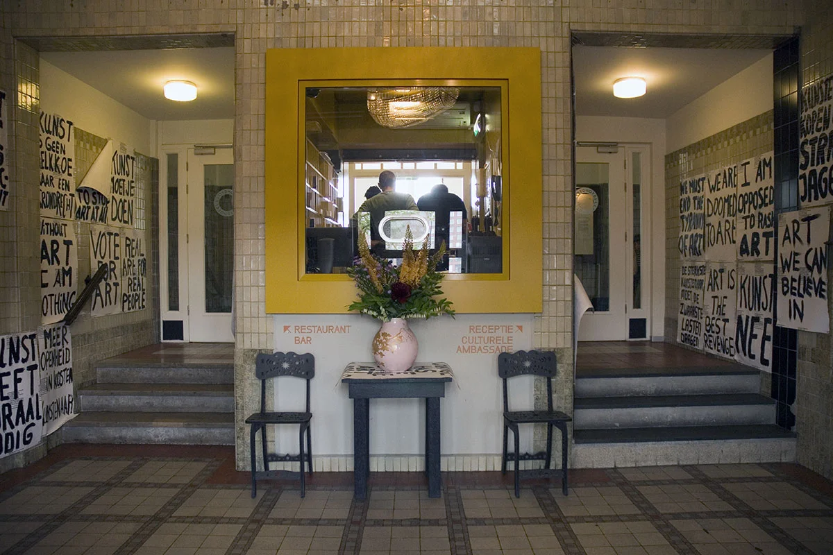
Starting point for his edition was Baruch-de-Spinoza-year and related events. The students have responded to the contemporary hyper-democracy in which politicians increasingly use power quotes and make populist statements to constantly demand attention from the public. In their designs, the students highlight this tendency by lifting arresting sound bites from their contexts and replacing key words with “art” or “artist”. Banners and posters graced the facades and entrances of contemporary art institutions in a temporary protest.
Altogether, the design became a unique one that evinces an ineffable tension. The students’ approach made the design real and unreal at the same time, both serious and at the edge of irony, political and beyond the political. It was a tension no designer could have achieved alone; its power lies in the sum of the different mentalities. The dialogue between the students continued in the design. It constituted a discussion about ‘democratic space’ as well as an invitation for visitors to look at art in this context and to take the conversation forward. In this decade of crisis, it is particularly important to emphasize what art and design can mean for public discourse and thereby for democratic culture.
TEMPORARY MUSEUM AMSTERDAM 2008


temporary museum amsterdam 2007


Like the event, the graphic design is based on the idea of temporariness and has three main “pillars”. The map of the city, with only the collaborating art institutions as landmarks including the routes in between, forms the basis of the design. Although it’s perfectly detailed, it looks almost like a hand drawn sketch, as if someone has drawn his dream. All real facades of the institutions are hatched with white horizontal lines, hand painted.
This is a strong eye-catcher and makes the visitor recognize immediately that he is still in the temporary museum. At the same time this horizontal hatching is the strongest visual element in all graphics, from the logo to posters and t-shirts. Type-designer Anton Koovit specially developed the stencil typeface Adam, which also became his graduation project for the master course “Type and Media”. The type has a unique character and although with monumental elements, it’s breading ephemerality. All elements, from logo to website, from car to guide, are in black and white.
And where possible only untreated materials are used and environmentally friendly paper — being critical in what and how much we can use for a temporary event.
temporary museum amsterdam 2006


The first edition in 2006 the concept of the “city as a museum” was developed, together with a suitable design. For the institutions it was the first time collaborating in this specific context. So we all needed to figure out what this project potentially could be, also within the given low budget. As a result the focus was on the representation of the temporary museum. The following editions there was more space, also mentally, to deepen the content of the event’s programme.
We started to think more and more what a project like the Temporary Museum means in a wider perspective. How does it relate to art production? What are the strategies behind presenting art? How can design conceive new relationships? How could graphics create an entity of a very fragmented reality? What new perspectives can design offer? These questions became starting points for additional programmes and design decisions.